Today we talked about typography and how different artists and designers design the alphabet to convey a certain atmosphere. Some artists and designers took the designs of the letterings even further and made them 3 dimensional or out of unconventional objects such as balloons.
It all depended on the what you were going to use the word for.
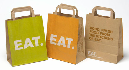
I like the company's Eat.'s packaging because it was clean and reminds me off both Alice in wonderland's "eat me" cookies and a packet of food that came from the future.
It all depended on the what you were going to use the word for.
I like the company's Eat.'s packaging because it was clean and reminds me off both Alice in wonderland's "eat me" cookies and a packet of food that came from the future.
Other people used it as a physical thing. Edward Ruscha for example focuses on words and make them into an abstract but physical representation of what they represent. I enjoy this idea because when you think of a word there are many different associations that go with it, and in a way Ruscha can be seen as both an artist and a designer.
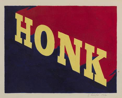
This piece of work for by Ruscha is a good example of how he does word associations. When you think of a honk it is louder than the background and so warm intense colours such as yellow and red on a blue background are perfect. A honk also expands out, the sound often elongates and so does the text. The font itself is strong and big; it demands to be seen much like an actual honking noise demands to be heard.
Our assignment for this course was to describe our favourite work of art in 15 words then minimise it to just 5 words, then take those five words (or less) and create something from it. I had so many ideas that I didn't know where to start. I began by writing them all down in a notebook and researching digital designers, surreal artists and social media website. I decided on designing a poster where there is a person in the middle of an ominous road wearing a laptop over their head, with the words "disguise" written across the screen in a Facebook type font.
I went to the library to do extra research and found many interesting books and articles written about advertising. There were a few creative ones such as the United Colours of Benetton campaign, Greenpeace adverts and a CSI advert that really caught my eye. I would like to consider doing something similar as an extension to this project such as creating an installation or something.
I went to the library to do extra research and found many interesting books and articles written about advertising. There were a few creative ones such as the United Colours of Benetton campaign, Greenpeace adverts and a CSI advert that really caught my eye. I would like to consider doing something similar as an extension to this project such as creating an installation or something.
 RSS Feed