I have decided to screw it. I have come to conclusion that my brother both knows and does not know what he wants. I reviewed the notes that he initially sent me.
1. He wants something clean
2. Professional
3. But with personality (I'm just going to translate this to appeals to students)
My second wack at it has proven to be successful; though it's now where near to good or professional. It is better.
1. He wants something clean
2. Professional
3. But with personality (I'm just going to translate this to appeals to students)
My second wack at it has proven to be successful; though it's now where near to good or professional. It is better.
2nd Try
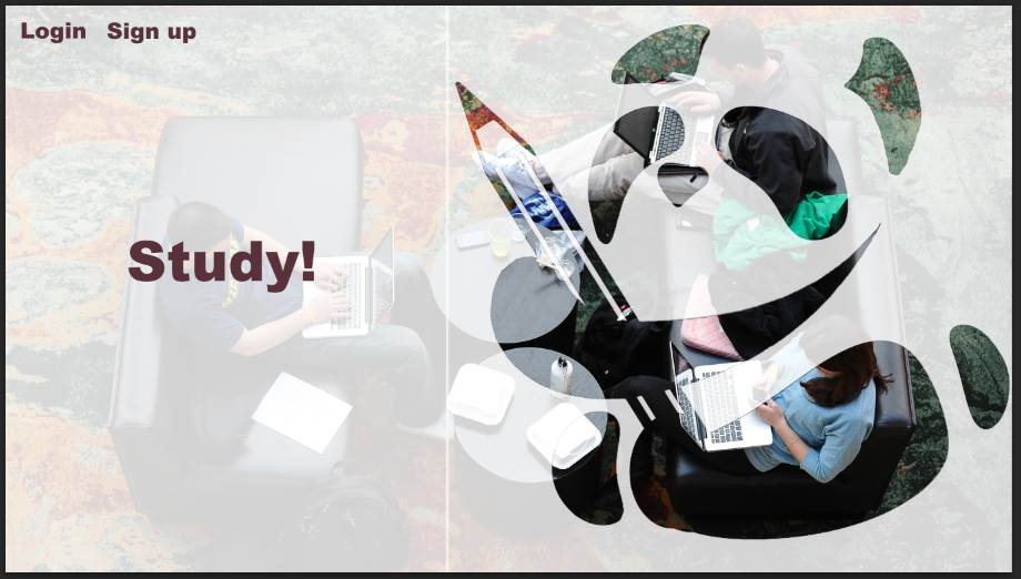
I like the affect that the opacity gives, it gives the web page a more interactive and 3 dimensional affect. I have also recently learned that high quality image makes a website look infinitely more expensive. I have made some photoshop mistakes however. I couldn't combine these two squares together without making this annoying line across the page. I'm also not 100% happy with the layout however.
 RSS Feed