So I've bettered my design, still no where near where I want it to be, but I won't be bettering it as my brother and his friends have decided to hire someone. I've learned a lot working with them but I'm also glad. This definitely took up way too much of my time and I'm starting to stress about my work that I have to start. I know this campaign is going to take a lot of time to do properly and I hope I can finish in time.
Changing the Logo

I've decided to take my previous logo and tinker with it a little. The panda with the pencil just has too much going on. I tried making this one as simple as possible but have it retain many of its positive qualities. I decided to just get rid of the mouth and change the colour so that it is visible against the Jumbotron
The Jumbotron
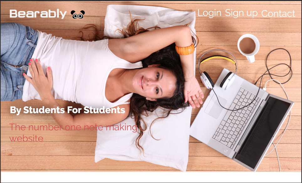
I took a high quality, attractive sleek image for the Jumbotron off the internet and I used the colours a reference for a pallet. Looking back, I feel like the tabs on the right could have been smaller, but over all I'm happy with the look, its simple and modern. I even aded a slight shadow for the text "By students For Students" it made the text legable agains the light background. The splash of colour from the text "The number one note making website" is really affective, unfortunately does become harder to read as it approaches her skin.
The rest of the page
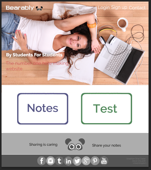
After googling web designs I learned that web designers design the entire page in one instead of what is just visible on the screen. I liked that I kept the footer monochromatic, it keeps the website clean. I think I could have added more content for the front page just to make it seem a little more full and draw boy from the Notes and Test buttons, but all in all I was happy with my improvement.
 RSS Feed